Product landing pages: from first screen to payment
How I ran course pages as a product: product logic and structure, metrics along the path to payment, copy with the editor and UX reviews of layouts together with designers
- Product Manager
- 2026
3%+
conversion of course landing pages to payment
10+
product pages launched and updated
5–7 → 2–3
days from brief to a live page
Context and goal
EdTech specifics
The product has to be promoted all the time: new courses and cohorts come out every season, and each needs its own page. Here the landing page is the main go-to-market tool: it explains the product, removes doubts and leads to payment.
Goal
Grow the metrics along the whole user path up to the start of the course: landing conversion to a request and to payment, conversion at the payment step and how fast people reach the target action.
My role
I owned the product logic, page structure and page metrics. I wrote the copy together with the editor. I worked in a pair with the designer: the designer made the layouts, I looked at them from a user-experience point of view, gave feedback and ran reviews.
Approach: metrics along the whole path to payment
A landing page is one step in a chain, and it should be judged by what happens next. We decided whether pages worked using three groups of metrics.
Conversion at key steps
Registration, request, choosing a tier, payment: at which step people drop off.
Deal cycle
How fast people get from the first visit to the target action. A short course has a short sales window, and a long cycle means lost money.
Release speed
How long it takes from brief to a live page. The faster the release, the more hypotheses we can test in a season.
The same three groups of metrics fit any product sold through a page: SaaS, subscription services, marketplaces.
Every page shows what you’ll learn
A unique page for every course. The courses are different, and each page shows what the person will learn. A template doesn’t work here: the product has to be visible from the first screen.
Figma Motion Ninja. A course on motion design in Figma. A static page can’t convey the main thing — that students will learn to bring interfaces to life. So the first screen mirrors working in Figma: designers’ cursors move the labels and a selection frame follows the text. The course group filled up completely.
How we worked with the designer. I built the page structure and logic and wrote the copy with the editor; the designer made the layout. Then I looked at it through the user’s eyes — is it clear from the first screen what the course is, what it costs and what to click — and gave feedback before the page went to build.
› See the whole Figma Motion Ninja page scroll
Vibe Coding Master: the page as the course result
A promise of a result. The page’s main promise: after the course you’ll have a live service in production that you can put in your portfolio or launch as your own project. The first screen looks like a code editor, and the programme is laid out as the steps of building a service, from describing the idea to launching it with a landing page and analytics.
Trust. The course is led by a practising developer with a design background, and the page shows it with facts: companies, projects and launched products.
A repeat purchase. The page immediately offers a second course 20% cheaper: a short course becomes the first purchase in a chain.
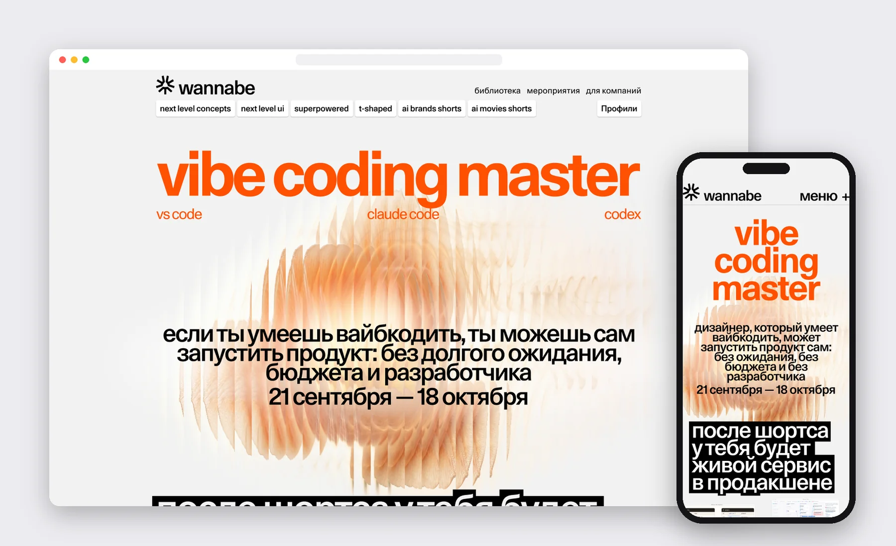
› See the whole page scroll
The path to payment: what we changed at the purchase step
Deadlines that work. The price rose in steps, and each step had its own label with a date on the page. For a short course the start date turned out to be a stronger deadline than the price: most sales came just before the start.
The button is always at hand. The join button stays on screen after the first screen and leads straight to the pricing tiers.
The payment step. We highlighted the promo-code field so people didn’t leave to look for a discount, removed split payments where they only confused people, and added a choice of payer: a person or a company paying by invoice.
A waitlist when enrolment is closed. When enrolment is closed, the page switches to a waitlist. Waitlist-to-payment conversion is usually high, so the waitlist warms people up for the next cohort.
Course bundles. A bonus for a second course and bundles of several courses in one payment raise revenue per buyer.
Home page and menu: a catalogue for a changing lineup
The problem. The lineup moved from large programmes to short courses and changed almost every week. The menu had equal links with no hierarchy, and the home page worked as a season manifesto that barely helped people find the right course.
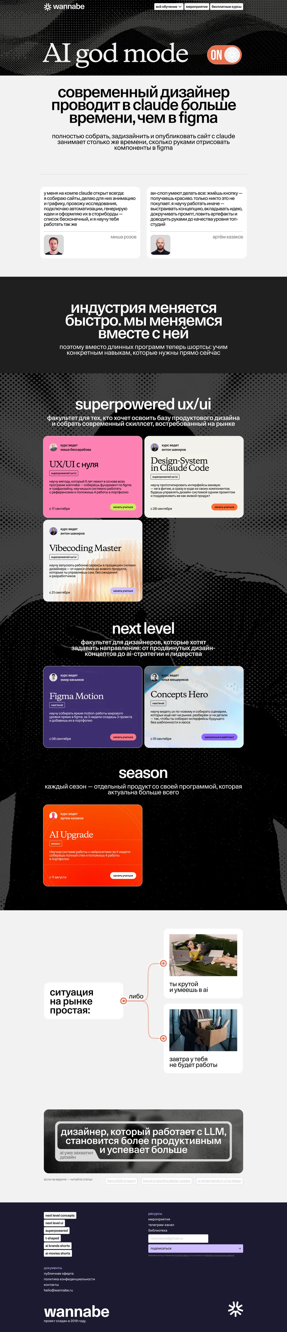
The solution. We built navigation around tracks and separate entry points: events, free products, corporate training, the archive. A course catalogue appeared on the home page after the first screen. A new course goes into its track, and the menu stays the same.
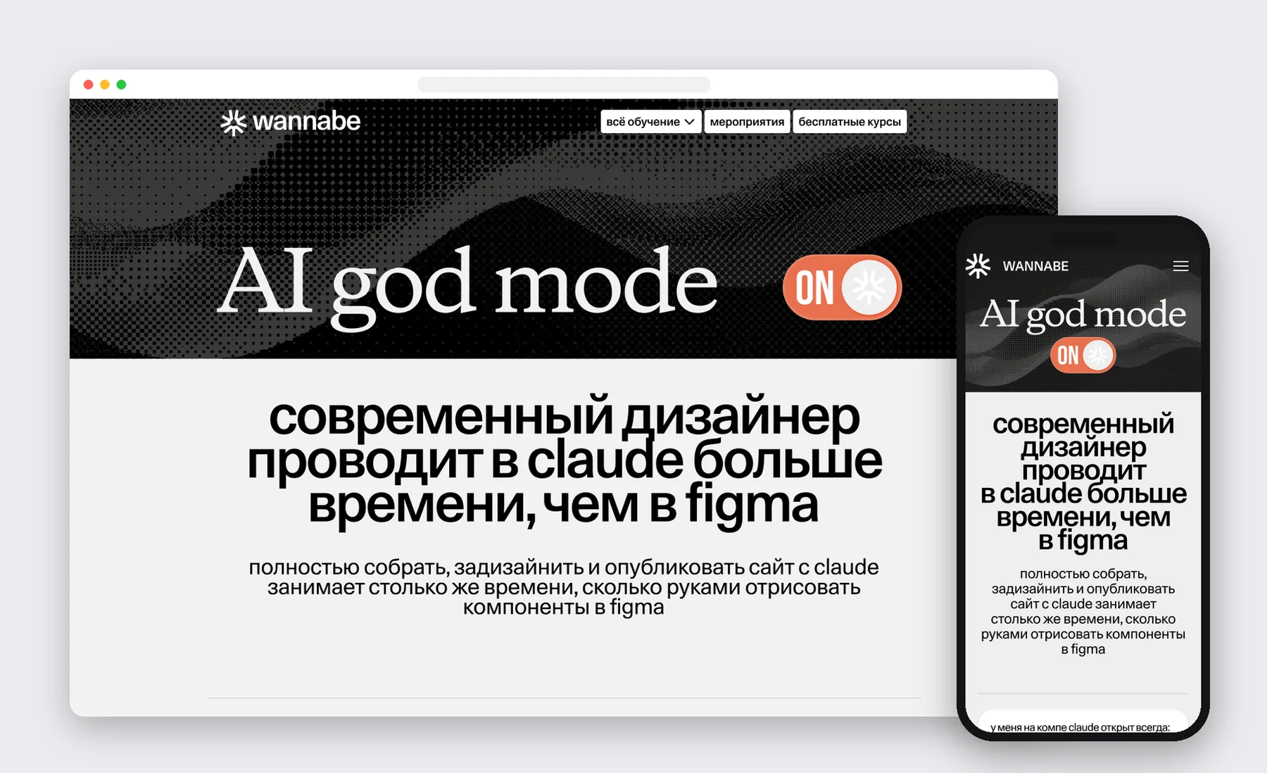
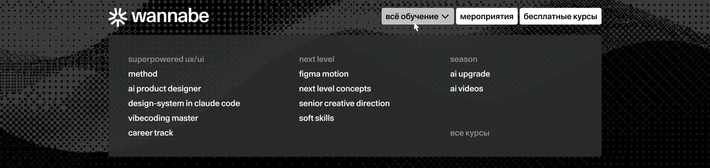
› See the full home page
Corporate track: a separate entry for companies
The problem. Companies regularly asked about training their teams, but the site had no entry for them. Requests came through personal messages and a shared inbox, so they couldn’t be counted, and the form on the site only suited those who had already decided to buy.
The solution. I relaunched the track through a dedicated page for companies: situations in which a client recognises their team, training formats, how the process works, experience with product teams and a request form. Short courses made the offer easier: sending a team to learn for a month is easier than for a quarter.
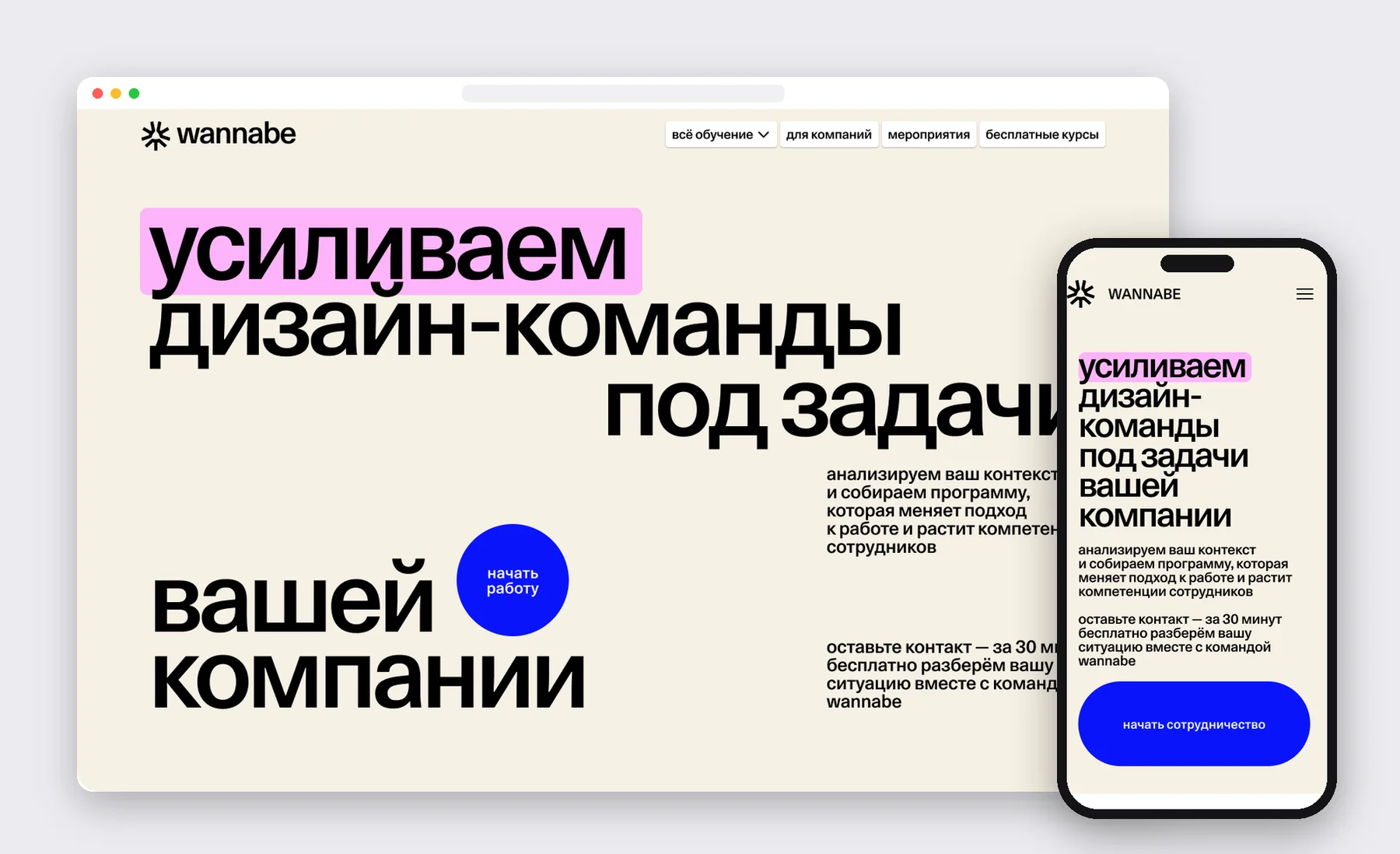
› See the full page for companies

What didn’t work
Pages outlived the products. Landing pages of large programmes kept showing dates and prices you could no longer buy at: people came from search and hit a dead offer. Now every page has a state — enrolling, waitlist or retired — and the menu shows only live products.
Payment errors were invisible. Some payments failed without a clear message, and we couldn’t see how many purchases we lost at that step. We added retries, an error log and clear messages for the buyer. The payment step is now tracked as a separate funnel stage.
The waitlist gave nothing in return. The form asked for contacts but gave neither a start date nor a price range, so we lost people who don’t want to leave their contacts for nothing. I proposed giving the waitlist early access to the price, a seat in the feedback group and an approximate date.
What works in any product
- 01
Judge a landing page by payments. A great first screen is worth nothing if people get lost at the payment step.
- 02
The page should show the product. The closer a page is to what people will get, the less it has to explain.
- 03
A deadline has to be real. For a short product the start date works better than a discount.
- 04
Closed enrolment keeps selling. A waitlist turns a closed sale into a warm-up for the next cohort.
- 05
Every page has a shelf life. Past dates and prices push away people who came from search.
- 06
A UX review is cheaper than a rebuild. Asking whether it’s clear what to click before the build saves days of work.
«In the last quarter Ilya launched product pages on his own, actively using the design system and AI tools, which doubled release speed and reduced design and development costs.»